
How Christian Book Covers Earn Attention Without Looking Generic
Learn how Christian authors can design book covers that communicate genre, remain readable at thumbnail size, avoid faith-based clichés, and meet current KDP production requirements.
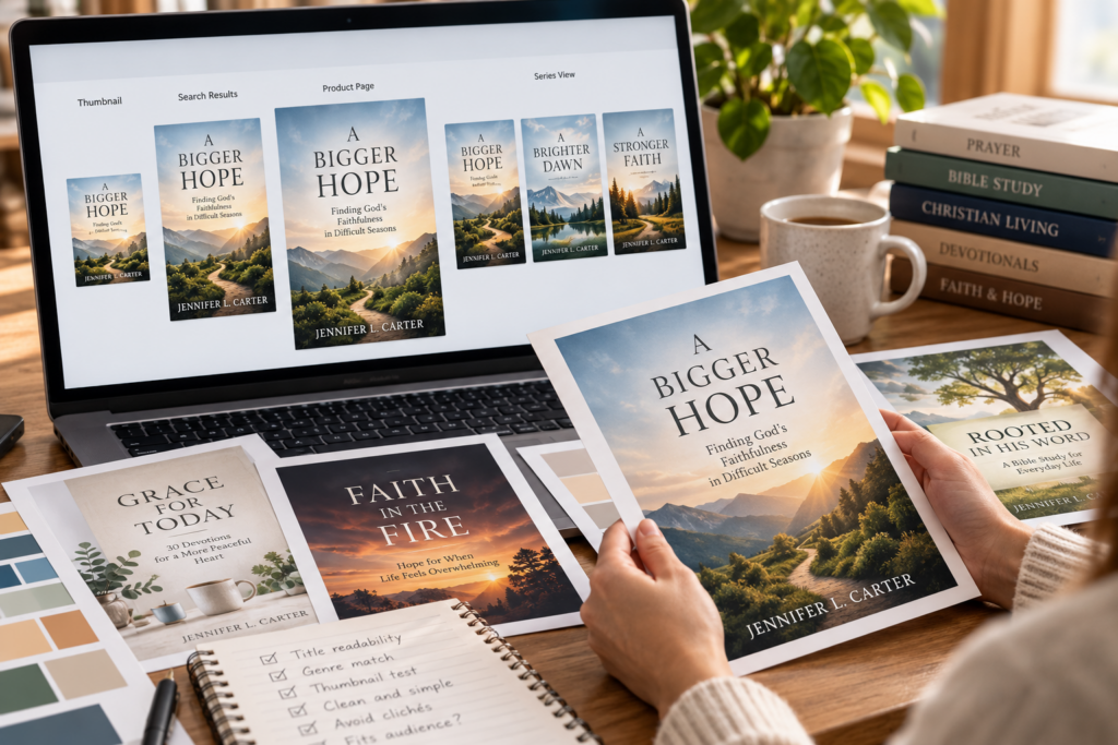
A book cover has to work before a reader knows whether the manuscript is good.
On Amazon, that often means surviving the thumbnail test first.
Readers may encounter your book among dozens of other titles in search results, recommendation carousels, category pages, ads, and author pages. If the cover is difficult to read, visually confusing, or indistinguishable from every other book in the category, the reader may never reach the description.
For Christian authors, there is an additional challenge.
The cover needs to communicate the book’s category and audience without falling automatically into familiar faith-based clichés.
The goal is not to make a book look less Christian.
It is to make the cover look intentional, professional, and appropriate for the reader it was created to reach.
Start With the Thumbnail Test
Authors often review covers at full size because that is how the designer created them.
Readers frequently do not.
A cover may first appear only a few inches tall on a phone or even smaller in a desktop recommendation row.
That changes what matters.
At thumbnail size, readers should still be able to identify the primary visual idea and read the main title.
Fine details disappear.
Thin fonts weaken.
Complicated backgrounds become noise.
Subtitles may become unreadable.
That is not necessarily a problem if the title and central concept still work.
Before approving a cover, shrink it dramatically.
Ask:
Can I still read the title?
Can I understand the central image?
Does anything important disappear?
Does the book still resemble other successful books in its category?
If the design works only when enlarged, it is not finished.
Make the Genre Clear Before Trying to Be Original
A cover is not a blank canvas.
It is also a communication tool.
Readers have learned to associate certain visual styles with particular types of books. Christian romance, devotionals, Bible studies, memoirs, children’s books, suspense novels, theological works, and Christian living titles all create different expectations.
Your cover does not need to imitate competing books.
But it should help readers understand what kind of experience they are being offered.
A devotional should not accidentally resemble a crime thriller.
A Christian suspense novel should not look like a pastoral counseling guide.
A Bible study workbook should not look like a children’s picture book.
Study current books serving the same audience.
Look for recurring patterns in:
- typography
- imagery
- color
- title placement
- subtitle treatment
- visual complexity
- author-name prominence
- illustration versus photography
Then ask how your book can fit the category while still establishing its own identity.
Avoid Christian Cover Clichés by Default
Open Bibles.
Crosses.
Sunlight through clouds.
Hands in prayer.
Mountain peaks.
Church steeples.
These images are not inherently bad.
Some books genuinely call for them.
The problem appears when they become automatic visual shorthand for “Christian book.”
If every devotional uses the same sunrise, every prayer book uses praying hands, and every faith memoir uses light breaking through clouds, readers have little reason to remember one title over another.
Start with the actual idea of the book.
What emotional experience should the cover communicate?
Comfort?
Courage?
Loss?
Hope?
Renewal?
Mystery?
Family?
Spiritual growth?
Leadership?
Then choose imagery that expresses that idea.
Faith identity can come through the title, subtitle, tone, symbolism, and overall positioning without requiring an obvious religious object on every cover.
Typography Does More Than Make the Title Readable
Typography communicates mood quickly.
A formal serif typeface can feel traditional, literary, scholarly, or historical.
A clean sans-serif face can feel modern, practical, direct, or contemporary.
A handwritten or script treatment can feel personal or intimate, but can also become difficult to read when overused.
There is no universal “Christian font.”
Choose typography based on the book category and emotional tone.
Readability remains essential.
The title should survive at thumbnail size.
Decorative type should not force readers to decipher the words.
And the hierarchy should be obvious.
Usually the eye should understand quickly which element is the title, which is the subtitle, and which is the author name.
That does not mean the title must always be the largest text. Established authors and certain series may use different hierarchies.
But the design should be intentional rather than accidental.
Keep the Visual Idea Simple
One strong idea usually works better than five competing ones.
A common DIY problem is trying to make the cover explain the entire manuscript.
The result might include:
a person
a Bible
a landscape
a church
a symbol
a quotation
multiple decorative elements
several fonts
a long subtitle
All on one cover.
Readers do not need a summary of the entire book in one image.
They need enough information to understand the tone and become curious.
Simplification can make the book feel more professional because it gives every element room to work.
Use Color to Support the Category and Message
Color affects mood, but it should not be treated as a rigid genre formula.
Rather than assuming that one genre “must” use blue or another “must” use red, study the books currently succeeding in your category.
Then consider whether your book should:
fit that visual environment
or
stand apart from it deliberately
A limited palette often makes a design easier to control.
Too many competing colors can weaken hierarchy and make small covers especially difficult to read.
Contrast matters more than color symbolism alone.
The title should remain visible against the background.
Important faces and objects should not disappear.
And the cover should remain recognizable even when reduced dramatically.
Design for the Reader, Not the Author
Authors naturally become emotionally attached to details from their manuscripts.
A location may matter deeply to you.
A symbolic object may appear in chapter twelve.
A particular scene may have inspired the entire book.
That does not automatically make it the best cover image.
The cover exists to help the right reader understand and choose the book.
When evaluating a concept, ask:
Would someone unfamiliar with the manuscript understand this?
Does it communicate the category?
Does it create the right emotional expectation?
Would the intended reader recognize this as something meant for them?
The strongest cover idea is often the one that communicates most clearly, not the one containing the most insider meaning.
Know When DIY Is Appropriate
Not every book requires the same design investment.
A simple workbook, internal ministry resource, short lead magnet, or experimental project may be manageable with accessible design software.
A commercial novel, illustrated children’s book, premium devotional, or major series may benefit much more from an experienced cover designer.
The question is not whether software such as Canva, Photoshop, Affinity, or another design platform is “good enough.”
The tool does not create professional judgment.
A skilled designer can produce strong work in many applications.
An inexperienced designer can produce weak work in expensive software.
If you design the cover yourself, study typography, composition, image licensing, print requirements, and genre conventions before treating a template as finished.
Use Templates Carefully
Templates can save time.
They can also make unrelated books look interchangeable.
If you start with a template, customize more than the title and background image.
Consider changing:
- typography
- spacing
- visual hierarchy
- image treatment
- color palette
- decorative elements
- layout proportions
The goal is to use the template as a structural starting point rather than allowing the template to define the identity of the book.
Be Careful With Stock Images
Stock photography can work well when it is chosen carefully.
The problem is not that an image is stock.
The problem is choosing imagery that feels overly familiar, generic, or inconsistent with the book.
Search beyond the first obvious results.
Try different conceptual terms rather than only literal ones.
A book about grief does not necessarily need a visibly grieving person.
A devotional about peace does not automatically need a sunrise.
A Christian marriage book does not always need a smiling couple standing in a field.
Strong covers often communicate indirectly.
Also verify the licensing terms for any stock image before using it commercially.
Use AI-Generated Art Carefully
AI-generated images create new possibilities for authors, but they also require judgment.
Check the platform’s commercial-use terms.
Inspect the image closely for visual errors.
Be especially careful with hands, text, faces, religious symbols, historical details, cultural representation, and repeated or distorted objects.
Do not assume that an attractive generated image is automatically publication-ready.
And if the cover combines generated imagery with human design work, keep records of the tools and source materials used as part of your production files.
AI can help create visual concepts.
Professional finishing still matters.
Make Series Branding Consistent Without Making Every Cover Identical
A series should feel connected.
That does not mean every cover should be the same design with a different title.
Useful repeated elements might include:
- typography family
- title placement
- logo or series mark
- framing device
- illustration style
- color system
- author-name treatment
Then vary the focal image, dominant color, or other distinguishing element.
Readers should be able to recognize both things quickly:
This belongs to the same series.
and
This is a different book.
Understand the Difference Between Ebook and Print Covers
A Kindle ebook uses a front marketing cover only.
Amazon currently recommends a marketing cover image of 2,560 pixels high by 1,600 pixels wide, at a minimum of 300 DPI/PPI, with JPEG preferred and RGB color mode. Kindle Direct Publishing
Print covers are different.
A paperback cover must include the back cover, spine, and front cover as one print-ready PDF. KDP calculates the exact dimensions from trim size, page count, paper, ink, and binding details. Kindle Direct Publishing
That means you should not simply stretch an ebook cover into a paperback template.
Build the print cover from the actual production specifications.
Use KDP’s Cover Calculator for Print
Spine width changes with page count and paper choice.
KDP provides a cover calculator and downloadable template specifically so authors can generate the correct full-cover dimensions. Kindle Direct Publishing
Use it.
For print, KDP currently requires bleed on all covers, with artwork extending 0.125 inches beyond the trim line where appropriate. Images should be at least 300 DPI, and text should remain inside the safe areas. Kindle Direct Publishing
KDP also currently requires a minimum page count before spine text can be used. Kindle Direct Publishing
Those are production requirements, not design preferences.
Check the current KDP specifications again when preparing each final file because platform requirements can change.
Order a Physical Proof
A print cover does not truly exist only on the screen.
Order a proof.
Check:
- color
- contrast
- trimming
- spine alignment
- text placement
- image sharpness
- back-cover readability
- barcode placement
- finish
- overall feel in the hand
A cover can look polished on a monitor and still reveal problems in print.
Physical proofing is especially important when the design contains dark imagery, subtle gradients, fine text, or elements close to trim boundaries.
Test the Cover With People Who Match the Audience
Do not ask only:
Do you like this cover?
That question produces subjective answers.
Instead ask:
What kind of book do you think this is?
Who do you think it is written for?
Which title would you click first?
What do you notice first?
Can you read the title at this size?
What do you expect the book to feel like?
Those questions reveal whether the cover is communicating correctly.
A beautiful cover aimed at the wrong expectation can still fail.
Do Not Redesign Simply Because Sales Are Slow
A weak cover can reduce interest.
But poor sales do not automatically prove the cover is the problem.
Other causes may include:
weak positioning
poor metadata
limited reviews
pricing
an unclear book description
lack of traffic
weak category fit
a small audience
Before replacing a cover, look at the entire sales path.
If people see the book but rarely click, the cover and title deserve closer examination.
If they click but do not buy, the issue may be elsewhere.
Diagnose before redesigning.
Frequently Asked Questions
Should Christian books always look obviously Christian?
No. The cover should fit the book and audience. Some titles benefit from explicit Christian imagery, while others communicate their faith identity more effectively through title, subtitle, symbolism, tone, and positioning.
Can I use the same front cover for ebook and paperback?
Yes, the front visual identity can remain consistent, but the print version requires a complete wraparound file containing back cover, spine when applicable, and front cover according to KDP’s current print specifications. Kindle Direct Publishing
Should I design my own cover?
You can, particularly for simpler projects, but understand the difference between operating design software and making professional design decisions. Commercial books benefit from strong typography, composition, image licensing, genre awareness, and production knowledge.
How often should I change a book cover?
There is no universal schedule. Consider redesigning when the cover clearly no longer fits the market, branding changes, the book is being relaunched, or performance evidence suggests the cover may be limiting interest.
Do I need a different cover for every book in a series?
Each title should be distinguishable, but repeated visual elements can create strong series recognition.
What is the most important cover test?
Make sure the right reader can quickly understand what kind of book it is and can still recognize the title and central concept when the cover is shown as a small thumbnail.
Make the Cover Earn the Next Click
A cover does not have to explain the entire book.
It has to make the right reader stop long enough to want to know more.
That requires more than attractive artwork.
It requires clear category signals, readable typography, intentional imagery, strong hierarchy, careful production, and an understanding of the reader.
For Christian authors, the challenge is not to hide the faith element.
It is to present it with enough creativity and professionalism that the cover does not disappear into a shelf of books that all look the same.
Design for the reader.
Test at thumbnail size.
Proof the physical book.
Then let the cover do its first job well:
Earn the next look.