KDP Ebook Formatting: How to Avoid Reader-Device Problems
A Kindle ebook can look perfect on your computer and still break on another device. Learn how to choose reflowable or fixed layout, prepare DOCX, EPUB, or KPF files, and test your ebook across Kindle screens.
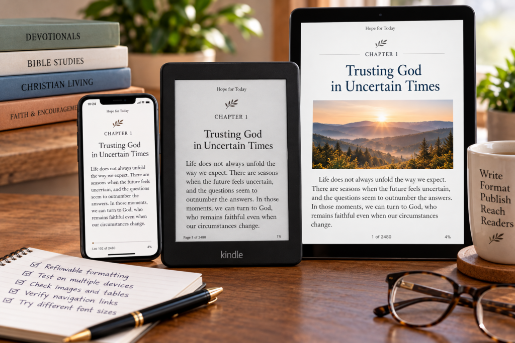
A Kindle ebook can look perfect on your computer and still behave badly on a phone, tablet, or Kindle device.
That happens because ebooks are not just digital copies of printed pages.
Most Kindle books are designed to reflow. Readers can change font size, line spacing, margins, and device orientation. Your formatting has to survive those changes.
For Christian authors publishing devotionals, Bible studies, fiction, memoirs, and nonfiction, the goal is not to force every device to display the same page.
The goal is to make the book remain readable, organized, and attractive everywhere.
Understand Reflowable vs Fixed Layout First
This is the most important formatting decision.
A reflowable ebook allows text to adapt to the reader’s screen and preferences.
That is usually best for:
- novels
- memoirs
- devotionals
- Christian nonfiction
- most Bible studies
- text-heavy books
A fixed-layout ebook keeps text and images positioned more precisely on the page.
That can make sense for:
- children’s picture books
- comics
- graphic novels
- highly visual books where placement is essential
Do not choose fixed layout simply because you want the ebook to look exactly like the paperback.
For most text-based books, reflowable formatting gives readers the better experience.
Why Reflowable Books Work Better on Multiple Devices
A Kindle reader may open your book on:
- a phone
- a tablet
- a Kindle e-reader
- a desktop reading app
Each screen is different.
With a reflowable ebook, the text adjusts automatically.
Readers can enlarge type.
They can narrow or widen margins.
They can use accessibility settings.
They can change orientation.
That flexibility is a feature, not a formatting problem.
Your job is to structure the book so those changes do not break it.
Use DOCX, EPUB, or KPF for Reflowable Kindle Books
For modern Kindle publishing, the most practical formats for reflowable ebooks are:
- DOC
- DOCX
- EPUB
- KPF
KPF is Amazon’s Kindle Package Format and is created through Kindle Create.
Amazon currently recommends KPF when using Kindle Create because it supports Kindle-specific formatting features particularly well.
EPUB is also an excellent choice, especially when using professional formatting software.
DOCX works well for straightforward books prepared carefully in Microsoft Word.
The best choice depends on your workflow, not on one format magically being superior for every book.
Word Works Well When the Book Is Simple
A clean DOCX manuscript can work very well for:
- novels
- memoirs
- straightforward devotionals
- Christian nonfiction
- simple study guides
The key is to use Word correctly.
Use paragraph styles.
Use proper headings.
Use real page breaks.
Use paragraph settings for indentation and spacing.
Avoid building layouts with:
- repeated spaces
- multiple tabs
- dozens of blank lines
- floating text boxes
- decorative shapes
- manually positioned elements
Those techniques may look right in Word but can behave unpredictably when the ebook reflows.
Kindle Create Can Simplify Formatting
Kindle Create is especially useful for authors who do not want to hand-build an EPUB.
You can import a Word manuscript and use Kindle Create to establish:
- chapter titles
- themes
- table of contents
- chapter-opening design
- images
- other Kindle-specific formatting
You can then export a KPF file for upload.
For many first-time Christian authors, this is a practical middle ground between basic Word formatting and professional EPUB production.
EPUB Gives You Greater Structural Control
EPUB is a standard ebook format built from structured content rather than fixed pages.
A well-built EPUB can handle:
- headings
- images
- internal navigation
- styling
- tables
- semantic structure
- accessibility elements
This makes EPUB attractive for professionally formatted books.
Tools such as Vellum, Atticus, Scrivener, Reedsy, and other publishing software can produce EPUB files.
The important point is not simply that the file ends in .epub.
It still needs to be built and tested correctly.
Fixed Layout Should Be Used Deliberately
Fixed layout is appropriate when the relationship between text and imagery is essential.
For example, a children’s picture book may rely on a sentence appearing in a precise location beside an illustration.
A comic depends on panels remaining in specific positions.
Those books may require fixed layout.
But a devotional with decorative images usually does not.
A Bible study with a few charts usually does not.
A cookbook does not automatically require fixed layout simply because it contains photographs.
Ask:
Does the reader need every element to remain locked in the same position for the content to make sense?
If not, reflowable may still be the better choice.
PDF Is Usually Not the Right Choice for a Reflowable Ebook
PDF is built around fixed pages.
Kindle ebooks are usually intended to adapt to different screens.
That makes PDF a poor starting point for most conventional Kindle books.
If you have a novel, devotional, memoir, or nonfiction title, use a reflowable format instead.
PDF belongs much more naturally in print production, where fixed pages are exactly what you want.
This is one of the most important distinctions between ebook and paperback formatting.
Do Not Confuse Print Formatting With Ebook Formatting
A print interior may include:
- fixed page numbers
- running headers
- precise margins
- gutter measurements
- blank pages
- exact chapter placement
Those features make sense on paper.
They may create awkward results in an ebook.
Likewise, a Kindle file designed to reflow is not automatically ready for paperback printing.
Treat the ebook and print editions as separate production formats.
They can share the same manuscript.
They should not automatically share the same final file.
Use Real Styles Instead of Visual Tricks
One of the best ways to prevent reader-device problems is to give the manuscript real structure.
For example:
Use a chapter-heading style for chapter titles.
Use a body-text style for paragraphs.
Use proper list formatting for lists.
Use paragraph settings for spacing.
Use real page breaks to begin chapters.
This gives the conversion system meaningful structure to work with.
Manual formatting tries to imitate structure visually.
Styles actually define it.
Be Careful With Text Boxes and Shapes
Text boxes may work beautifully in Word.
They are much less reliable in a reflowable ebook.
The same is true of decorative shapes and complex diagrams created from separate Word elements.
If a diagram must remain intact, consider converting the entire diagram into a single image.
That prevents pieces from moving separately when the text reflows.
For ordinary sidebars or callouts, consider whether a simple heading and paragraph would work better than a floating box.
Simplicity is often an advantage on Kindle.
Tables Need Testing
Tables are another common trouble spot.
A table that fits comfortably across a desktop Word document may be too wide for a phone.
That can lead to:
- squeezed text
- tiny type
- awkward scrolling
- broken columns
If the information can be presented as a list, that may be more readable.
If the table is essential, keep it simple and test it on small screens.
Bible studies sometimes use charts heavily.
Those are exactly the books where device testing matters.
Images Should Support the Reading Experience
Images can work well in Kindle books.
The challenge is making them readable at multiple sizes.
Check:
- captions
- text embedded inside images
- charts
- diagrams
- photographs
- maps
- decorative elements
Avoid putting essential information into tiny text inside a graphic.
That graphic may look excellent on a tablet and become unreadable on a phone.
If the wording matters, consider placing it as actual ebook text instead.
Christian Books Have Their Own Formatting Trouble Spots
Faith-based books often include structures that need extra attention.
For example:
Scripture quotations
Long block quotations should remain readable when font size changes.
Prayer sections
Make sure visual separation does not depend on excessive blank space.
Reflection questions
Numbered or bulleted questions should remain clearly grouped.
Bible-study tables
Test them on smaller displays.
Verse references
Keep references connected clearly to the quotations they support.
Callout boxes
Consider whether simple headings would work better than complicated visual boxes.
The reader should never have to fight the formatting to understand the devotional or study.
Do Not Rely on Blank Lines for Spacing
Pressing Enter repeatedly may create attractive space in Word.
In an ebook, that space can become excessive.
Readers using larger fonts may encounter nearly empty screens between sections.
Use paragraph spacing settings instead.
This creates a cleaner and more predictable result.
The same principle applies to chapter openings.
Do not create vertical positioning by adding fifteen empty paragraphs.
Let the ebook flow naturally.
Custom Fonts Are Not the Main Goal
One of the advantages of Kindle reading is that readers can often choose the font they prefer.
That means authors should not design ordinary reflowable books around preserving one exact body font.
Typography still matters.
But ebook typography is about hierarchy and readability more than rigid control.
Use formatting to establish:
- chapter hierarchy
- emphasis
- quotations
- section breaks
Let the reader control the basic reading experience where appropriate.
Test Navigation Carefully
A Kindle book should be easy to move through.
Check:
- table of contents
- chapter links
- internal links
- footnote links
- return links
- section navigation
A broken table of contents immediately makes a professional book feel amateurish.
Bible studies and nonfiction titles often rely more heavily on internal navigation than novels.
Test every important link.
Kindle Previewer Should Be Part of Your Workflow
Amazon’s Kindle Previewer allows you to inspect how a reflowable ebook behaves across several device types.
Use it.
Do not simply glance at the first chapter.
Check:
- phone view
- tablet view
- Kindle e-reader view
Then inspect:
- front matter
- table of contents
- chapter starts
- images
- block quotations
- lists
- tables
- hyperlinks
- final pages
Problems often appear in places authors do not expect.
Test at Different Font Sizes
This is one of the easiest checks to overlook.
Your book may look excellent at the default font size.
Increase it.
Then increase it again.
Ask:
Does the chapter heading still work?
Do the images remain sensible?
Does Scripture formatting stay readable?
Do callout sections become awkward?
Can a reader using larger type still navigate comfortably?
A reflowable book should survive the reader changing the reading environment.
Test on a Phone
A phone screen is unforgiving.
Wide tables become obvious problems.
Long headings wrap strangely.
Graphics containing tiny text become unreadable.
Spacing that seemed elegant on a tablet may feel excessive.
If the book remains usable on a phone, it will usually behave much better elsewhere.
Use the Online Previewer Before Submission
After uploading the ebook to KDP, perform another check using Amazon’s online previewer.
Think of this as your last inspection after conversion.
Do not assume that because the source file passed Kindle Previewer, nothing can go wrong during upload.
Review it again.
Publishing quality comes from checking at multiple stages.
MOBI Is No Longer the Format to Use
MOBI was once common in Kindle workflows.
That era is over.
KDP stopped accepting MOBI for new or updated ebook uploads in March 2025.
For modern reflowable ebooks, use formats such as:
- EPUB
- KPF
- DOC
- DOCX
If an old tutorial tells you to create a MOBI file for KDP, it is outdated.
Reader Experience Matters More Than Pixel-Perfect Control
Authors naturally want the ebook to look exactly the way they designed it.
But that is not always what the reader wants.
Someone reading late at night may enlarge the font.
Someone with low vision may use much larger text.
Someone on a phone may need narrower margins.
Someone may prefer a different Kindle font.
Good ebook formatting respects those choices.
A reflowable ebook is successful when it remains organized and readable as the reader changes the display.
Frequently Asked Questions
What is the best format for a normal Kindle ebook?
For most reflowable ebooks, DOCX, EPUB, or KPF are strong choices. DOCX works well for straightforward manuscripts, EPUB gives more structural control, and KPF works especially well with Kindle Create.
Should I use fixed layout for a devotional?
Usually not. Most devotionals are text-heavy and benefit from reflowable formatting. Fixed layout is more appropriate when exact image and text placement is essential.
Should children’s books use fixed layout?
Many picture books do because the relationship between illustration and text is part of the storytelling. The decision still depends on the specific design.
Can I upload MOBI to KDP?
Not for new or updated ebook uploads. KDP discontinued MOBI upload support in March 2025.
Should I use PDF for my Kindle ebook?
Usually not for a standard reflowable book. PDF is based on fixed pages and is generally better suited to print production.
Can the same ebook look different on different Kindle devices?
Yes. Reflowable ebooks adapt to different screen sizes, fonts, spacing preferences, and device settings. That is expected behavior.
How do I know whether the formatting works?
Preview the ebook across phone, tablet, and Kindle e-reader views. Test navigation, images, headings, Scripture quotations, tables, and multiple font sizes before publishing.
Can I use my paperback interior as my ebook file?
You should not assume the print file will work properly as an ebook. Print and Kindle editions have different formatting requirements and reading behaviors.
Format for the Reader, Not the Screen in Front of You
The goal of ebook formatting is not to make every screen identical.
It is to make the reading experience reliable.
Choose reflowable formatting when readers need flexibility.
Use fixed layout only when page composition truly matters.
Keep Word files structurally clean.
Use EPUB or KPF when the book needs greater control.
Test the book across devices and font sizes.
And remember that the Kindle reader gets the final say over how large the type appears.
If your book still reads beautifully after they change those settings, your formatting is doing its job.